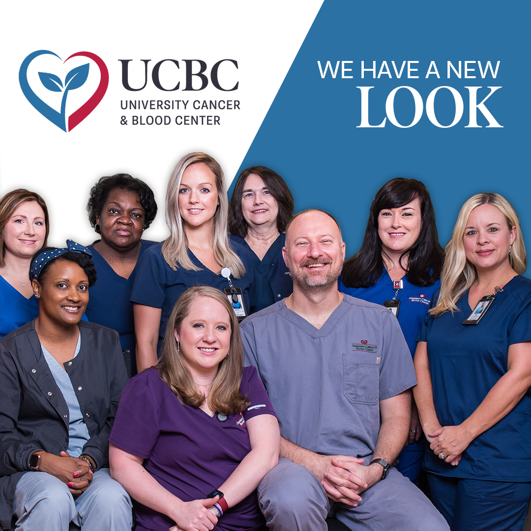
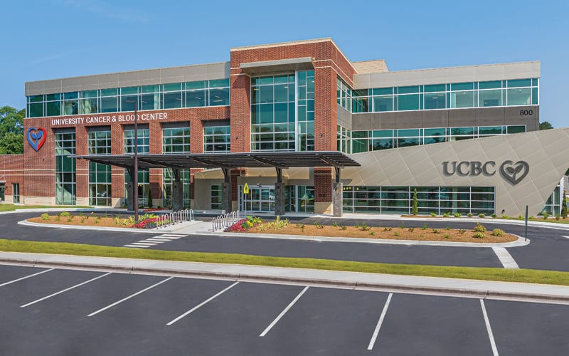
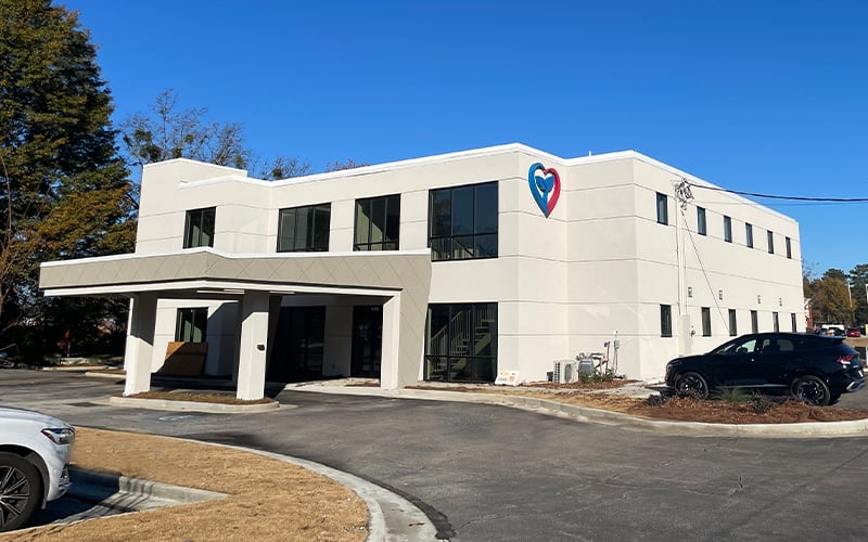
University Cancer & Blood Center has a new and refreshed look! Over the course of the past year we decided to stop, take a breath, acknowledge all the progress we’ve made, and partner with local branding and marketing agency, Kaptiv8, to revive the UCBC visual brand so that it would better represent our modern and innovative practice.
It was important to us that we preserve recognizable elements of our brand identity. The leaf element of our logo speaks to revitalization, and the heart represents livelihood. The refreshed heart, with bright and contemporary colors, is symbolic of continued hope and new beginnings for patients, as well as for UCBC’s future.
Along with a refreshed brand identity, we also wanted a modern website that mirrors the quality of the care provided at all of our facilities. The new UCBC website was created in hopes that it would convey a practice dedicated to quality, holistic care, leading-edge research, healing, and community. We hope the new site brings with it, clarity and ease of use.
All of our providers and staff are ecstatic about the journey ahead, and we hope you are, too! Everyone at UCBC looks forward to growing with the communities we serve to instill hope and healing before, during, and after cancer.
